2.7 KiB
| category | order | title |
|---|---|---|
| 十大原则 | 3 | Contrast |
Contrast is one of the effective ways to add visual interest to your page, and to create an organizational hierarchy among different element that aid user in finding the information quickly.
Note: The important rule for contrast to be effective, it must be strong. Don't be wimp.
The Contrast of major and minor relationship


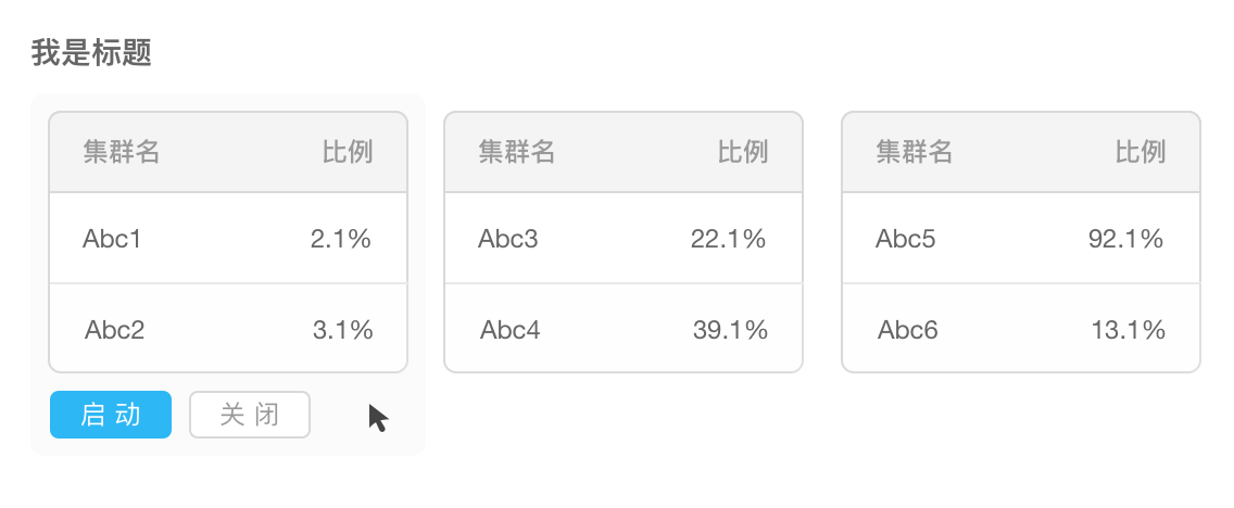
In order to help user make a quick operation (something like the form,modal), a more important operation or a operation with higher frequency would be emphasized.
Notes: ways of emphasizing are not just to intensify the key item. It could also weaken the other items.

When there’s something needs users to make decision prudently, the system should remain neutral. It shouldn’t make the decision for users or lead them to make judgement.
Contrast of whole and part


Taking advantage of changing the typesetting, the typeface and the size, we highlight the different levels and differentiate the ensemble and the part, which would make the page be more flexible and rhythmic.
Contrast of the state relation


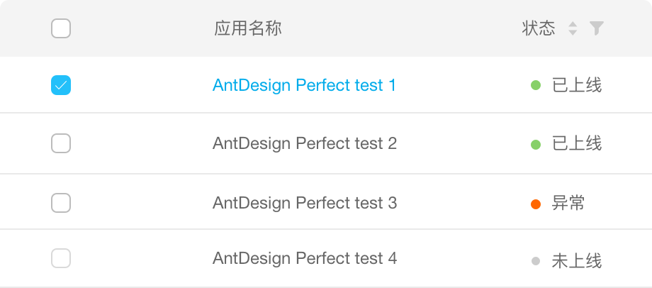
Taking advantage of changing colors and adding assistant shapes, we realize the comparison of state relation, which could help users differentiate various information better
The forms we usually see include 『static contrast』 and 『dynamic contrast』.