27 KiB
| title | order |
|---|---|
| How to Update | 3 |
Compared to G6 v4, G6 v5 introduces new capabilities in the following areas:
- 🎞 Visual and Animation Specification: Define styles and animations using JSON spec;
- 📂 Information Level of Details;
- 🎨 Simple and flexible Theme Configuration ability;
- 🤖 Flexible and powerful Data Processing capability;
- 🎄 Fusion of Tree Diagram and Graph structure;
- 🏀 3D large graph support;
- 🚀 Performance Improvements, including rendering and layout computations;
- 🌠 Multiple Renderers that can be switched at runtime.
- 📦 Reduced package size with support for TreeShaking.
The official version is coming soon. If these features are what you have been waiting for, you can now try the G6 5.0 Beta version! If you encounter any upgrade issues, please leave us a message on GitHub.
To support these new capabilities, there are significant Breaking Changes in G6 5.0 compared to v4, which may require some effort to upgrade. We hope that the benefits brought by the new capabilities outweigh the upgrade costs.
0️⃣. How to Use the New Features
1️⃣. Changes in Data Format
To achieve data layering, prevent data pollution, and better avoid the mixture of business data and rendering data, there have been significant changes to the data structure in G6 v5 compared to v4. The specific changes are as follows. G6 v5 provides a transformation handler for v4 data, which can be configured for use in the data processing module, for example:
const graph = new Graph({
  transforms: ['transform-v4-data'],
  // ... other configurations
  data: v4data, // A set of data in v4 format
});
The specific differences between the data formats of v4 and v5 are as follows:
v4 Data Structure
type GraphData = {
  nodes: NodeModel[];
  edges: EdgeModel[];
  combos: ComboModel[];
};

type ItemModel = {
  id: string;
  type?: string; // noe type, e.g. (if it is node) circle, rect, etc.
  label?: string; // label content
  color?: string; // keyShape color
  size?: number | number[]; // keyShape size
  visible?: boolean;
  style?: { [shapeAttr: string]: unkown }; // keyShape style
  labelCfg?: {
    position?: string;
    offset: number;
    refX: number;
    refY: number;
    style?: { [shapeAttr: string]: unkown }; // label style
    background?: { [shapeAttr: string]: unkown }; // label's background style
  };
};

type NodeModel = ItemModel & {
  comboId?: string;
  x?: number;
  y?: number;
  anchorPoints?: number[][];
  icon?: {
    show?: boolean;
    img?: string;
    text?: string;
    width?: number;
    height?: number;
    offset?: number;
  };
  linkPoints?: {
    top?: boolean;
    right?: boolean;
    bottom?: boolean;
    left?: boolean;
    size?: number;
    [shapeAttr: string]: unkown;
  };
  // There will be different configurations for different node types
  // e.g. modelRect's preRect, image's clipCfg, etc.
};

type EdgeModel = ItemModel & {
  source: string;
  target: string;
  sourceAnchor?: number;
  targetAnchor?: number;
  controlPoints?: IPoint[]; // for polyline
  loopCfg?: LoopConfig; // for loop
  curveOffset?: number | number[]; // for quadratic/cubic
  minCurveOffset?: number | number[]; // for quadratic/cubic
  curvePosition?: number | number[]; // for quadratic/cubic
};
v5 Data Structure
In v5, for node data, except for id, and for edge data, except for id, source, and target, all content should be placed in the data object:
type GraphData = {
  nodes: NodeModel[];
  edges: EdgeModel[];
  combos: ComboModel[];
};

type NodeModel = {
  id: string;
  type?: string; // node type, e.g. circle-node, rect-node
  data: {
    x?: number;
    y?: number;
    z?: number;
    parentId?: string; // parent combo's id
    label?: string; // label content
    anchorPoints?: number[][];
    badges?: {
      type: 'icon' | 'text';
      text: string;
      position: BadgePosition;
    }[];
    icon?: {
      type: 'icon' | 'text';
      text?: string;
      img?: string;
    };
    [key: string]: unknown; // other bussiniess properties
  };
};

type EdgeModel = {
  id: string;
  source: string;
  target: string;
  data: {
    type?: string; // edge type, e.g. line-edge
    label?: string; // label content
    sourceAnchor?: number;
    targetAnchor?: number;
    icon?: {
      type: 'icon' | 'text';
      text?: string;
      img?: string;
    };
    badge?: {
      type: 'icon' | 'text';
      text: string;
    };
    [key: string]: unknown; // other bussiniess properties
  };
};
2️⃣. Data Loading
v4 Data Loading
import { Graph } from '@antv/g6';
import data from './data';
const graph = new Graph({
  // ... configuration
});
graph.data(data);
graph.render();
// Or combine the above two lines as: graph.read(data);
v5 Data Loading
The graph.data(data) and graph.render() methods are no longer supported. You can still use graph.read(data) or directly configure the data on the graph:
import { Graph } from '@antv/g6';
import data from './data';
const graph = new Graph({
  // ... configuration
  data: data,
});
// Or use: graph.read
3️⃣. Tree Graph
Graph Data in Tree Layout DEMO
v5 introduces new features related to Tree Graph:
- The layout and interaction are now universal in Graph. Graph can specify a root node and use the minimum spanning tree to establish the tree structure before using the tree graph layout algorithm.
- The interaction is now universal in Graph. Graph can expand and collapse "subtrees", which are nodes downstream without backtracking edges.
- Supports backward edges and loops.
- Supports forests (multiple trees).
Issues with v4 Tree Graph
The v4 Tree Graph has its own data structure (TreeGraphData as shown below), graph class (TreeGraph), interaction (collapse-expand), and layouts (Dendrogram/Indented/Mindmap/CompactBox). The data structure and layout methods are not universal in Graph, which makes it difficult for users to understand and convert:
- "How do I draw multiple trees?" - Not supported.
- "How do I add edges in a tree graph?" - Tree graphs do not allow loops.
- "How do I use a tree graph layout in a general graph?" - The layout is not universal.
- In v5, TreeGraph and Graph have been merged comprehensively.
// TreeGraph
type TreeGraphData {
  id: string;
  [key: string]: unknown;
  children: TreeGraphData[];
}
TreeGraph data has a nested structure and does not have explicit edges. The parent-child relationship represents the edges. TreeGraph does not support combo data configuration. Does not support loops and forests (multiple trees).
v5 Tree Graph
In v5, the graph now supports the data format of TreeGraph, and the layouts and interactions of both tree graph and general graph are now universal. If you need to use TreeGraphData, you just need to provide a data type flag when configuring the Graph:
const graph = new Graph({
  // ... other configurations
  data: {
    type: 'treeData', // type can be 'graphData', 'treeData', 'fetch', where fetch will be supported in the official version
    value: data, // when type is treeData, value can be TreeGraphData or TreeGraphData[] to support drawing forests
  },
});
In the "Data Loading" section above, we introduced the types of the data field. You can directly provide data of type GraphData, and G6 will handle it as a normal graph and generate tree graph structures when necessary (such as using tree graph layout and interaction). You can also specify the type as 'treeData' and provide data of type TreeGraphData to store the tree graph structure and convert it into normal graph data for storage.
In other words, in v5, there is no longer a separate TreeGraph class. There is only one Graph class. The APIs specific to the TreeGraph class in v4 can be replaced as follows:
| Functionality | v4 TreeGraph API | v5 Alternative |
|---|---|---|
| Add a subtree under a specified parent node | treeGraph.addChild(data, parent) | graph.addData('node', { id: 'new-child', { parentId: 'parent-node-id' }}) |
| Remove a specified subtree | treeGraph.removeChild(id) | graph.removeData('node', 'id-of-a-node'), if the removed node is not a leaf node, its child nodes are promoted to roots |
Partially update a subtree 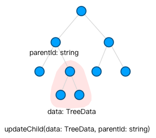 |
treeGraph.updateChild(data, parentId) | graph.updateItem('node', { id: 'id-of-a-node', data: { ... }}) to update each node individually. If you need to add a child node, use addData('node', { id: 'id-of-new-child', { parentId: 'parent-node-id' }}) and pay attention to the order of operations |
Partially update subtrees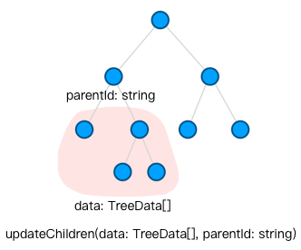 |
treeGraph.updateChildren(data, parentId) | Same as above |
| Change the parent node | Remove the child node from the original parent node by removeChild and add it to the new parent node by addChild | graph.updateData('node', { id: 'child-id', { parentId: 'new-parent-id' }}) |
4️⃣. Element Type Names
In v4, the built-in node types include circle, rect, ellipse, star, image, etc. These names may be ambiguous with the types of shapes. Therefore, in v5, they will be renamed to xx-node. For example, circle-node, rect-node, ellipse-node, star-node, image-node.
Similarly, edges will be renamed to line-edge, polyline-edge, cubic-edge, etc.
5️⃣. Introduction of Features
Using Features in v4
In v4, all features are automatically included in G6 by default, so they can be specified as strings when configuring the graph. This results in a large package size. For example:
import { Graph } from '@antv/g6';
const graph = new Graph({
  // ... other configurations
  modes: {
    default: ['drag-node', 'scroll-canvas'], // interaction names
  },
  defaultNode: {
    type: 'circle', // node type name
  },
  defaultEdge: {
    type: 'rect', // node type name
  },
  layout: {
    type: 'radial',
  },
});
Introduction and Use of Features in v5
In order to better support TreeShaking, only some basic capabilities are pre-registered in v5, and other built-in capabilities that have been implemented need to be manually registered by the user. Similarly, custom capabilities also need to be registered in the same way:
import { Graph, extend, Extensions } from '@antv/g6';
// External features
import { ForceLayout as ForceLayoutWASM, supportsThreads, initThreads } from '@antv/layout-wasm';
// Class CustomBehaviorClass...
// Class CustomEdge...
const ExtGraph = extend(Graph, {
  behaviors: {
    'activate-relations': Extensions.ActivateRelations, // built-in interaction, not pre-registered
    'some-custom-behavior': CustomBehaviorClass, // custom interaction
  },
  nodes: {
    'modelRect-node': Extensions.ModelRectNode, // built-in modelRect node, not pre-registered
  },
  edges: {
    'custom-edge': CustomEdge, // custom edge
  },
  layouts: {
    'force-wasm': ForceLayoutWASM,
  },
});
const supported = await supportsThreads();
const threads = await initThreads(supported);
// Instantiate the graph using the extended graph
const graph = new ExtGraph({
  // ... other configurations
  modes: {
    default: [
      'drag-node', // default registered interaction
      'activate-relations', // newly introduced and registered built-in interaction
      'some-custom-behavior', // custom interaction that was previously imported and registered
    ],
  },
  defaultNode: {
    type: 'modelRect-node', // newly introduced and registered built-in node type
  },
  defaultEdge: {
    type: 'custom-edge', // custom and registered edge type
  },
  layout: {
    type: 'force-wasm', // layout algorithm that was previously imported and registered from another package
    threads,
    maxIteration: 200,
  },
});
6️⃣. Layout Usage
We have refactored @antv/layout in v5, and considering the package size, we have only built-in circular / concentric / grid / force layouts. The usage is the same as v4. You can specify the layout name through type and pass in other layout parameters:
new Graph({
  //...other configurations
  layout: {
    type: 'force', // layout name
    preventOverlap: true,
    nodeSize: 30,
    workerEnabled: true, // support running in WebWorker
  },
});
For non-built-in layouts, we provide the following usage methods:
Use JS-based serial layout algorithm similar to @antv/layout in v4; Use the layout algorithm based on Rust bound to WASM and multiple WebWorkers in @antv/layout-wasm; Use the parallel layout algorithm based on WebGPU in @antv/layout-gpu; Fully custom layout. Compared with v4, G6 needs an additional step of registering the layout to the runtime standard library. Although some layouts may require additional asynchronous startup steps due to different implementations, the layout configuration is consistent. You can specify the layout name through type and then pass in other layout parameters.
The following example demonstrates the use of the newly added @antv/layout-wasm in v5. First, you need to register it to the runtime standard library of G6 and provide a custom layout name, which will be passed to layout later.
import { stdLib, Graph } from '@antv/g6';
import { supportsThreads, initThreads, ForceLayout as ForceLayoutWASM } from '@antv/layout-wasm';
// Register custom layout
const ExtGraph = extend(Graph, {
  layouts: {
    'force-wasm': ForceLayoutWASM,
  },
});
// Start WebWorker thread pool
const supported = await supportsThreads();
const threads = await initThreads(supported);
// Use the extended Graph
new ExtGraph({
  //...omit other configurations
  layout: {
    type: 'force-wasm', // consistent with the registration name
    threads, // thread configuration
    dimensions: 2,
    maxIteration: 100,
    //...omit other parameters of this layout
  },
});
If the provided layout implementations cannot meet your requirements, you can also fully customize the layout. When implementing the Layout interface provided by @antv/layout, you only need to implement the execute method and set assign to null. This ensures that the original graph model data is not affected.
import { Layout, LayoutMapping } from '@antv/layout';
class MyCustomLayout implements Layout<{}> {
  async assign(graph, options?: {}): Promise<void> {
    throw new Error('Method not implemented.');
  }
  async execute(graph, options?: {}): Promise<LayoutMapping> {
    const nodes = graph.getAllNodes();
    return {
      nodes: nodes.map((node) => ({
        id: node.id,
        data: {
          x: 0,
          y: 0,
        },
      })),
      edges: [],
    };
  }
  options: {};
  id: 'myCustomLayout';
}
// Register custom layout
const ExtGraph = extend(Graph, {
  layouts: {
    myCustomLayout: MyCustomLayout,
  },
});
// Use the extended Graph
new ExtGraph({
  layout: {
    type: 'myCustomLayout',
  },
});
7️⃣. Node/Edge/Combo Instance
In G6 v4, item instances of nodes and edges were exposed to users, but most of their APIs were covered by Graph. We recommend using Graph's APIs to facilitate unified management and interaction between multiple related nodes and edges. Therefore, in v5, we no longer expose item instances of nodes and edges, so the APIs are concentrated on Graph, and you can obtain the data of single/multiple nodes/edges through Graph, but cannot obtain the item.
Usage with item in v4
// Get all item instances on the graph
graph.getNodes();
graph.getEdges();
graph.getCombos();
// Item object being listened
graph.on('node:click', (e) => {
  const { item } = e; // item is the clicked item instance
  const itemType = item.getType(); // get the item type
});
// Get the data of the instance
item.getModel();
// Update the data of the instance
graph.updateItem(item, {
  // data
});
// Add node/edge/combo
graph.addItem('node', {
  // ...data
});
// Remove node/edge/combo
graph.removeItem(item);
Replacement API in v5
// Fetch all the data (inner data) from graph
graph.getAllNodesData();
graph.getAllEdgesData();
graph.getAllCombosData();

// parameters in event listeners
graph.on('node:click', (e) => {
  // the clicked item's type and id
  const { itemType, itemId } = e;
});

// fetch single data (inner data) from graph
graph.getNodeData(id);
graph.getEdgeData(id);
graph.getComboData(id);

// update node(s)/edge(s)/combo(s)
graph.updateData('node', [nodeModel1, nodeModel2]);
// add node(s)/edge(s)/combo(s)
graph.removeData('node', [nodeModel1, nodeModel2]);
// remove node(s)/edge(s)/combo(s)
graph.removeData('node', [id1, id2]);
8️⃣. Style Configuration
In v4, detailed graphic styles can be configured in the data or in the defaultNode and defaultEdge options of the graph. This can result in confusion when managing data as business properties and style configurations may be mixed together. Additionally, in v4, node/edge style configurations are static and global, meaning they cannot be mapped differently for different data.
Global Style Configuration in v4
const graph = new Graph({
  // ...other configurations
  defaultNode: {
    type: 'circle',
    style: {
      fill: '#f00',
      r: 20,
    },
  },
  defaultEdge: {
    type: 'poliline',
    style: {
      stroke: '#0f0',
      lineWidth: 2,
    },
  },
});
Style Mapping in v5
In v5, we recommend that users keep only necessary business properties and important simple style configurations (such as text content, badges, etc.) in the data, and place the style configurations in the node/edge mapper of the graph. Mappers are used in v5 to convert internal data flow into rendering data, and they are configured by users in the Graph JSON configuration. Of course, there are also some built-in mapper logics to convert text content, badges, etc. from user data to corresponding graphic properties.
const graph = new Graph({
  // ...other configurations
  node: nodeInnerModel => {
    const { id, data } = nodeInnerModel;
    // Return type is shown in the DisplayNodeModel type below
    return {
      id,
      data: {
        ...data,
        keyShape: {
          fill: data.important ? '#f00' : '#ccc',
          r: 20
        },
        labelShape: {
          text: data.label,
          position: 'bottom'
        },
      }
    }
  },
  // Edge configuration is similar
  edge: edgeInnerModel => {
    // Return type is shown in the DisplayEdgeModel type below
    return {...}
  }
});
// Content returned by the style configuration
type DisplayNodeModel = NodeModel & {
  id: string;
  type?: string; // Element type, e.g. circle-node, rect-node
  data: {
    x?: number;
    y?: number;
    z?: number;
    keyShape?: { [shapeAttr: string]: unknown }, // Styles of keyShape
    // Configuration and style for label. If not configured, this graphic does not exist.
    labelShape?: {
      position?: string,
      offsetX?: number,
      offsetY?: number,
      offsetZ?: number;
      [shapeAttr: string]: unknown
    },
    labelBackground?: { [shapeAttr: string]: unknown }, // Styles of label background. If not configured, this graphic does not exist.
    iconShape?: { [shapeAttr: string]: unknown }, // Styles of icon. If not configured, this graphic does not exist.
    badgeShapes?: {
      // Common style for all badge graphics. If not configured, this graphic does not exist.
      color?: string;
      textColor?: string;
      [shapeAttr: string]: unknown;
      // Individual styles and configurations for each badge
      [key: number]: {
        position?: IBadgePosition;
        color?: string;
        textColor?: string;
        [shapeAttr: string]: unknown;
      };
    };
    anchorShapes?: {
      // Common style for all anchor graphics. If not configured, this graphic does not exist.
      color?: string;
      textColor?: string;
      size?: number;
      offsetX?: number;
      offsetY?: number;
      offsetZ?: number;
      [shapeAttr: string]: unknown;
      // Individual styles and configurations for each anchor
      [key: number]: {
        position?: BadgePosition;
        color?: string;
        textColor?: string;
        size?: number;
        offsetX?: number;
        offsetY?: number;
        offsetZ?: number;
      	[shapeAttr: string]: unknown;
      };
    };
  }
}
type DisplayEdgeModel = {
  id: string;
  source: string,
  target: string,
  data: {
    type?: string, // Element type, e.g. line-edge
    sourceAnchor?: number,
    targetAnchor?: number,
  }
}
9️⃣. Events and Event Parameters
In v4, mousexx events were changed to pointerxx events in v5 to better support mobile events, as shown below:
// v4
graph.on('node:mousemove', (e) => {});
// v5
graph.on('node:pointermove', (e) => {});
// Similar event names:
// mousemove -> pointermove
// mouseenter -> pointerenter
// mouseleave -> pointerleave
// mousedown -> pointerdown
// mouseup -> pointerup
v4 Event Parameters
type GraphEvent = {
  item: Node | Edge | Combo;
  target: Shape;
  x: number;
  y: number;
  pointX: number;
  pointY: number;
  canvasX: number;
  canvasY: number;
  clientX: number;
  clientY: number;
  //... other parameters
};
v5 Event Parameters
In v5, elements are no longer exposed and the item will no longer exist in the event parameters. The v5 event parameters are as follows:
type GraphEvent = {
  itemId: string | number;
  itemType: 'node' | 'edge' | 'combo';
  target: Shape;
  // Coordinates of the current operation in four coordinate systems
  canvas: { x: number; y: number; z: number }; // Corresponds to x y or pointerX pointerY in v4, the coordinates for drawing the graph
  client: { x: number; y: number }; // Corresponds to clientX clientY in v4, the coordinates relative to the browser coordinate system
  viewport: { x: number; y: number }; // Corresponds to canvasX canvasY in v4, the coordinates relative to the Canvas DOM coordinate system
  screen: { x: number; y: number }; // Coordinates relative to the entire screen
  //... other parameters
};
🔟. Coordinate Systems
v4 Coordinate Systems
The v4 coordinate systems (three sets) are described in the documentation: https://g6.antv.antgroup.com/manual/advanced/coordinate-system
- v4 - clientX clientY: Coordinates relative to the browser coordinate system
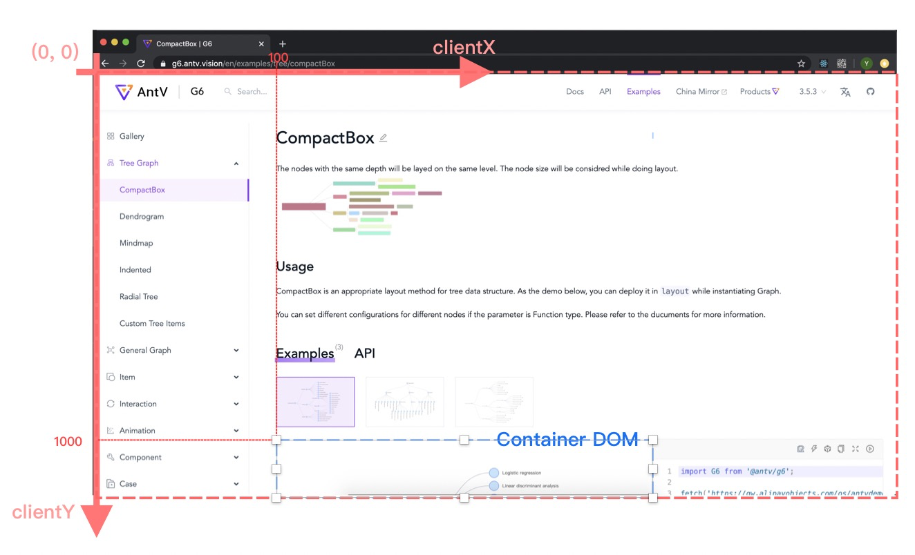
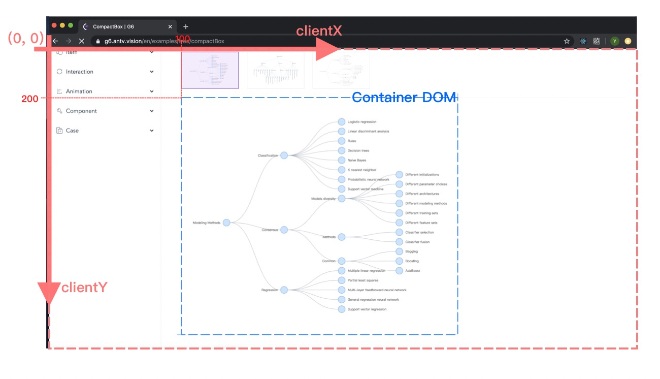
- v4 - canvasX canvasY: Coordinates relative to the canvas DOM
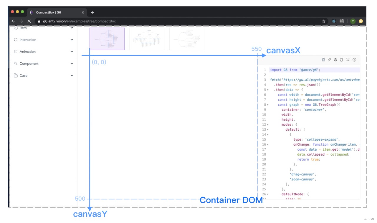
- v4 - pointX pointY (same as x y in v4 events): Coordinates for drawing the graph
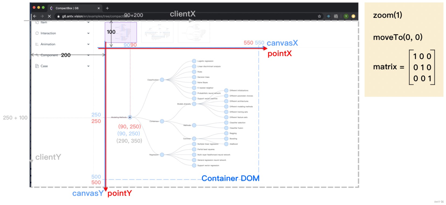
v5 Coordinate Systems
It should be noted that the coordinate systems in v5 (four sets) have different names.
| Meaning | v4 Coordinates | v5 Coordinates |
|---|---|---|
| Coordinates for drawing the graph | { x, y } or { pointerX, pointerY } | canvas: { x: number; y: number; z: number } |
| Coordinates relative to the browser coordinate system | { clientX, clientY } | client: { x: number; y: number; z: number } |
| Coordinates relative to the Canvas DOM coordinate system 系 | { canvasX, canvasY } | viewport: { x: number; y: number; z: number } |
Coordinates relative to the entire screen 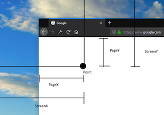 |
none | screen: { x: number; y: number; z: number } |