| .. | ||
| src | ||
| .npmignore | ||
| client.d.ts | ||
| client.js | ||
| package.json | ||
| README.md | ||
| README.zh-CN.md | ||
| server.d.ts | ||
| server.js | ||
English | 中文
Theme Editor
Note: The current theme feature is implemented based on antd 5.x version. It is recommended to read about the Customizing Theme concept before proceeding with this document.
Introduction
The plugin is essentially a tool for modifying the style of the entire front-end page. It currently supports editing global SeedToken, MapToken, and AliasToken, as well as enabling a switch to Dark Mode and Compact Mode. In the future, it may support component-level theme customization.
User Guide
Enabling The Theme Plugin
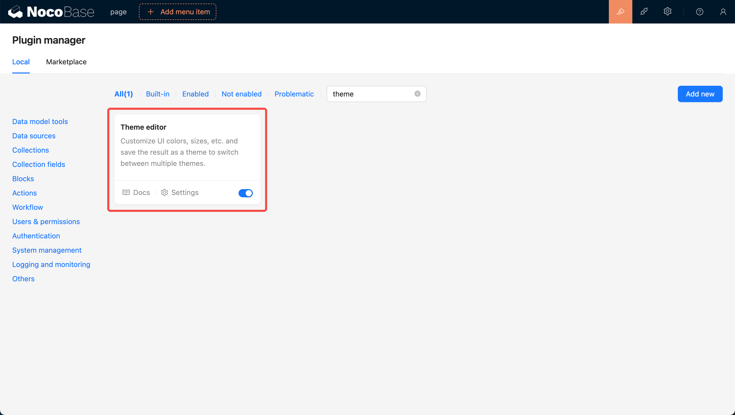
Firstly, update NocoBase to the latest version (v0.11.1 or above). Then, search for the Theme Editor card in the Plugin Management Page. Click on the Enable button at the bottom right of the card and wait for the page to refresh.
Navigate to the Theme Configuration Page
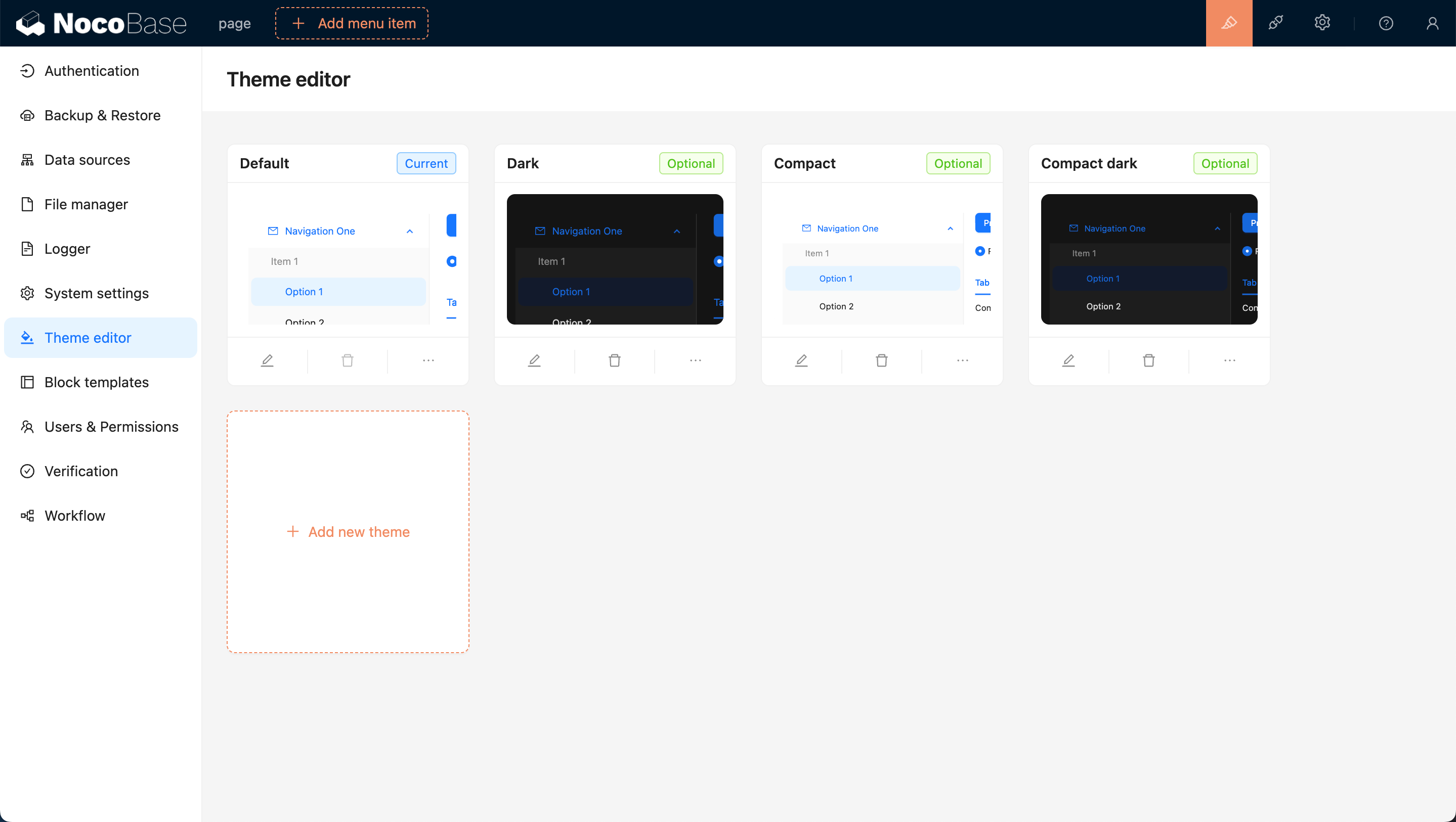
After enabling, click on the settings button at the bottom left of the card, and you will be redirected to the theme editing page. By default, there are four theme options: Default Theme, Dark Theme, Compact Theme, and Compact Dark Theme.
Adding a New Theme
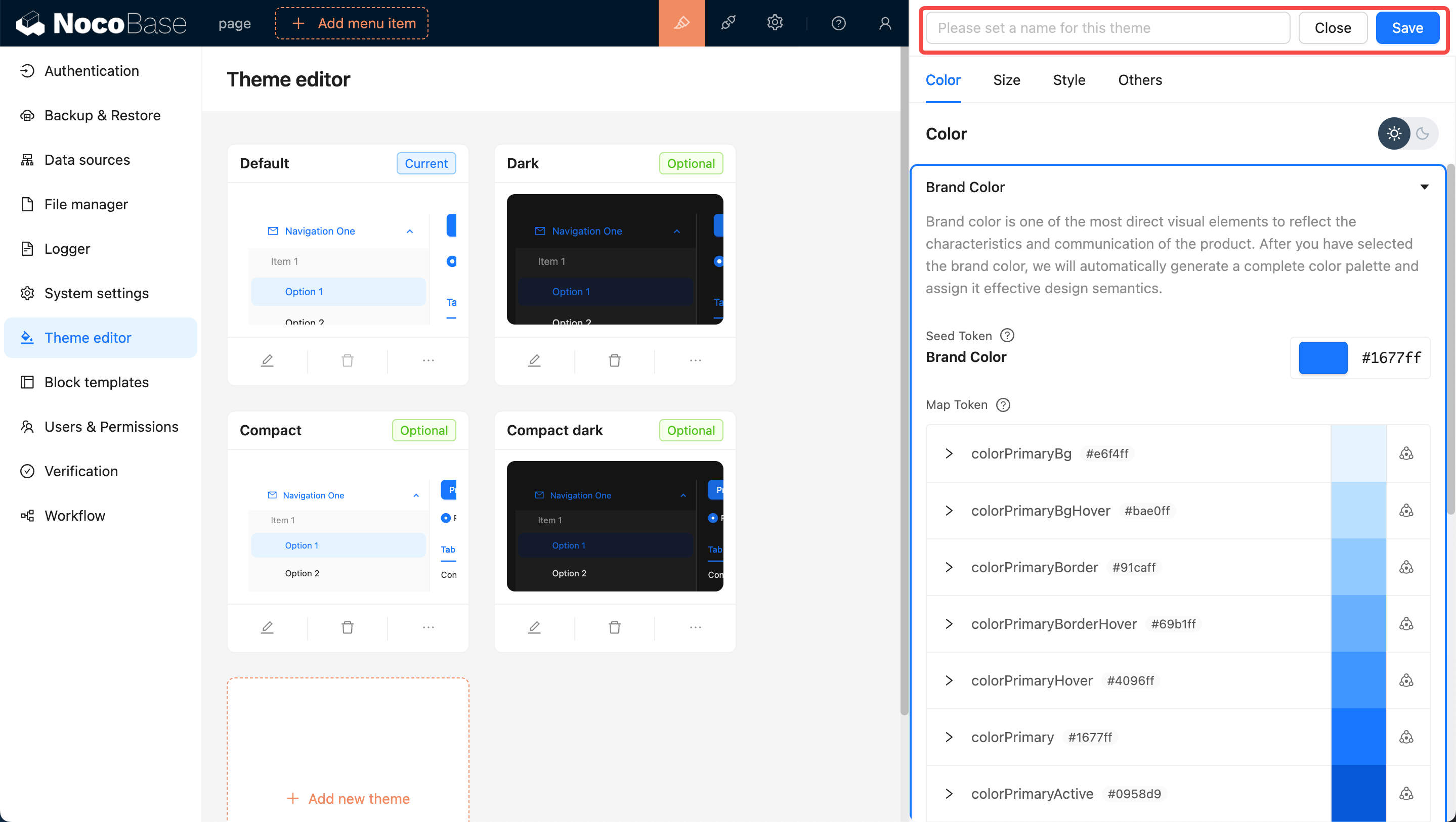
Click the Add New Theme button and choose Create a Brand New Theme. A Theme Editor will pop up on the right side of the page, allowing you to edit Colors, Sizes, Styles, and more. After editing, enter a theme name and click save to add the new theme.
Applying the New Theme
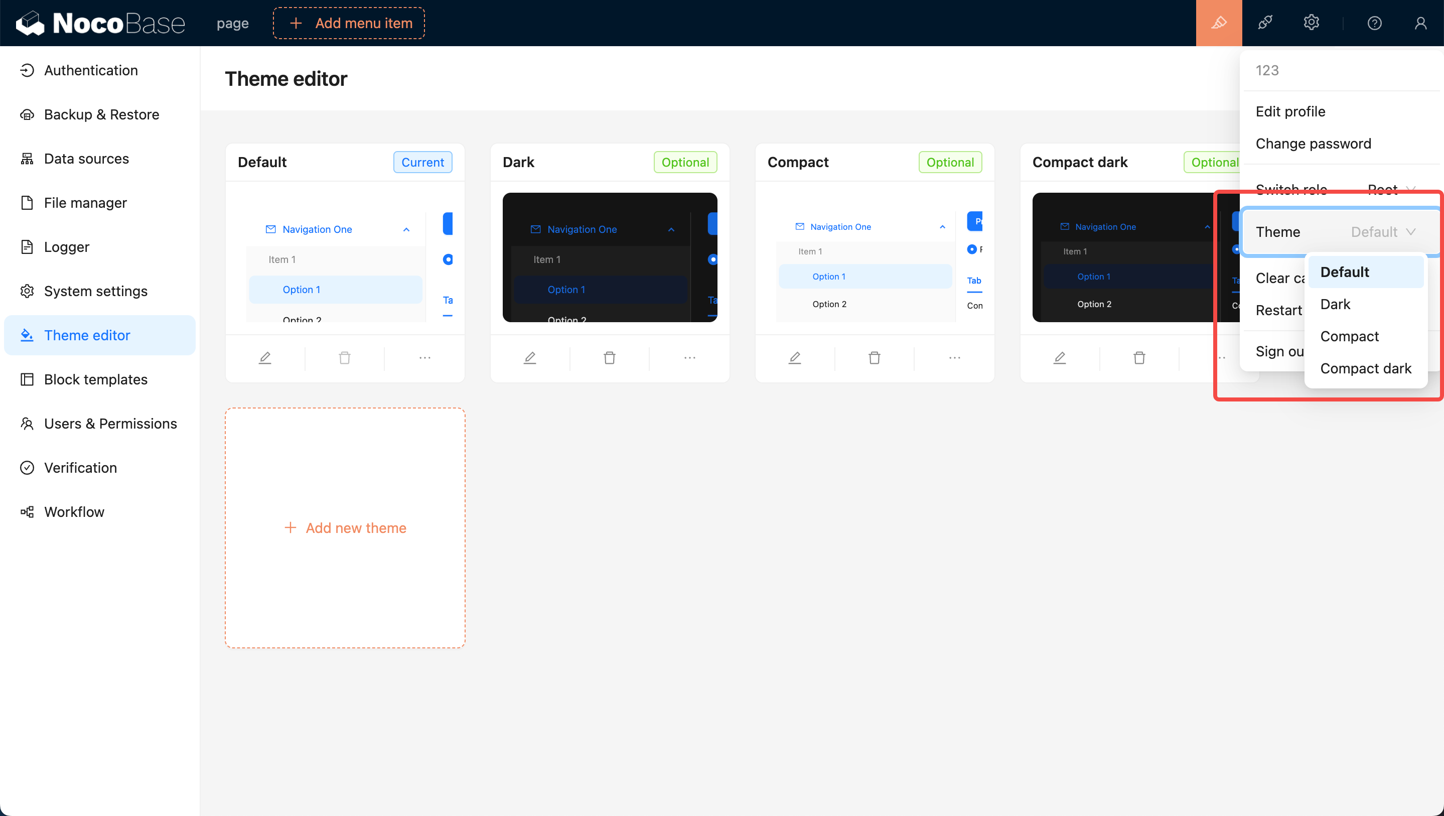
You can move the mouse to the top right corner of the page, where you will see a theme switcher. Clicking on it allows you to switch to other themes, such as the newly added theme.
Editing an Existing Theme
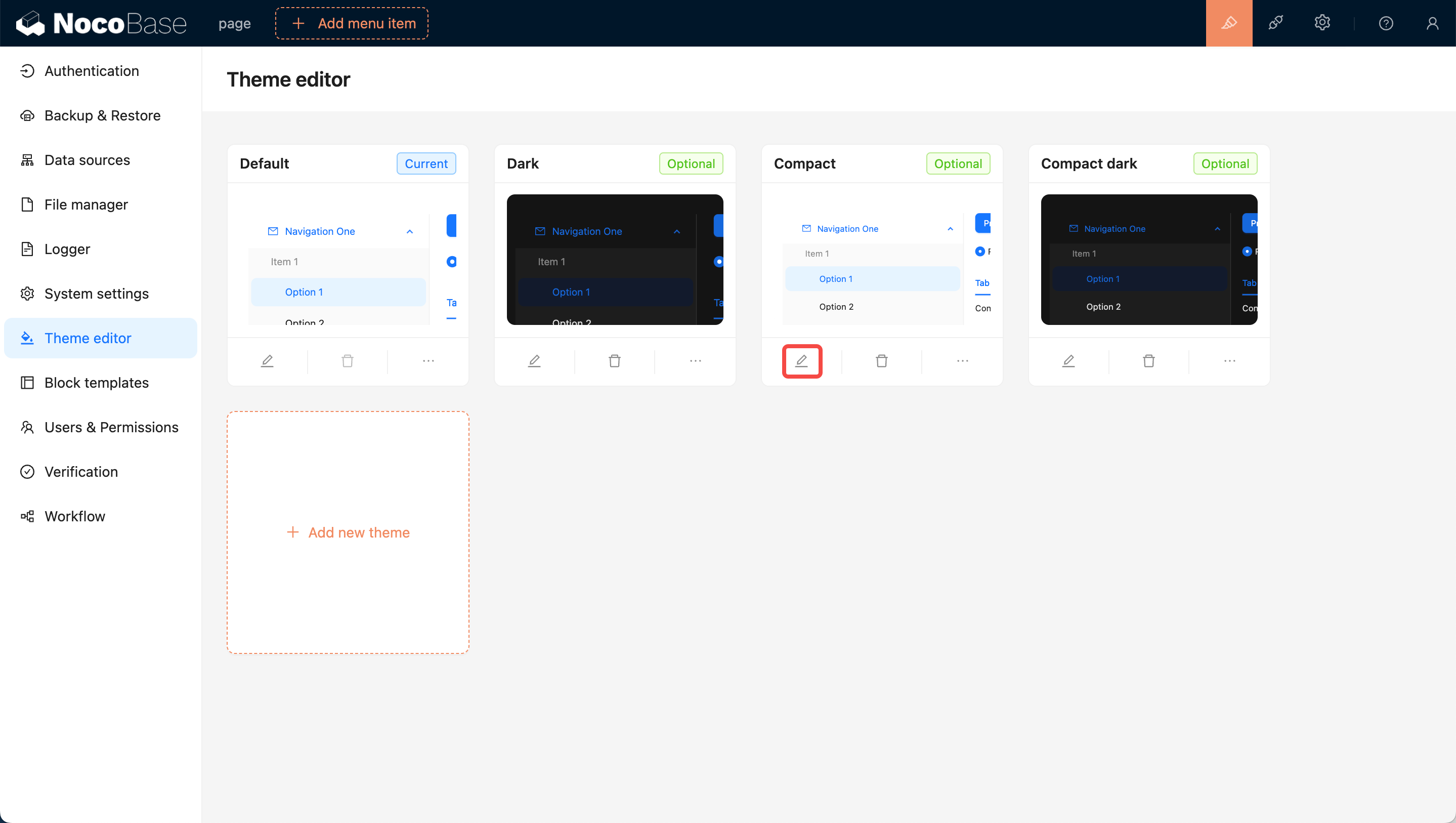
Click the Edit button at the bottom left of the card. Similar to adding a new theme, a Theme Editor will pop up on the right side of the page. After editing, click save to complete the theme modification.
User Options for Theme Switching
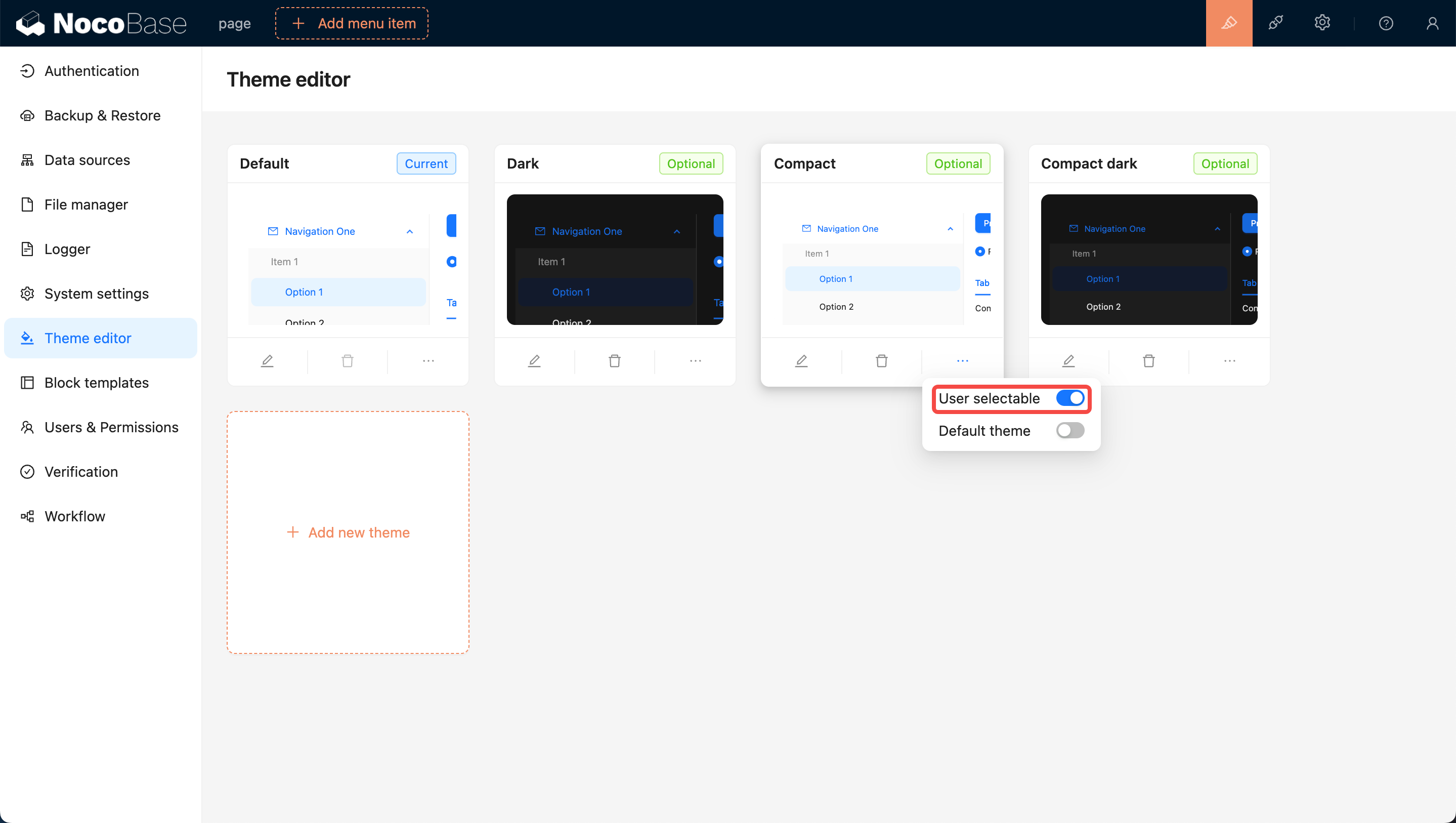
Newly added themes are by default available for users to switch to. If you do not want users to switch to a certain theme, you can turn off the User selectable switch at the bottom right of the theme card, making it unavailable for users to choose.
Setting as Default Theme (The Default Theme Cannot Be Deleted)
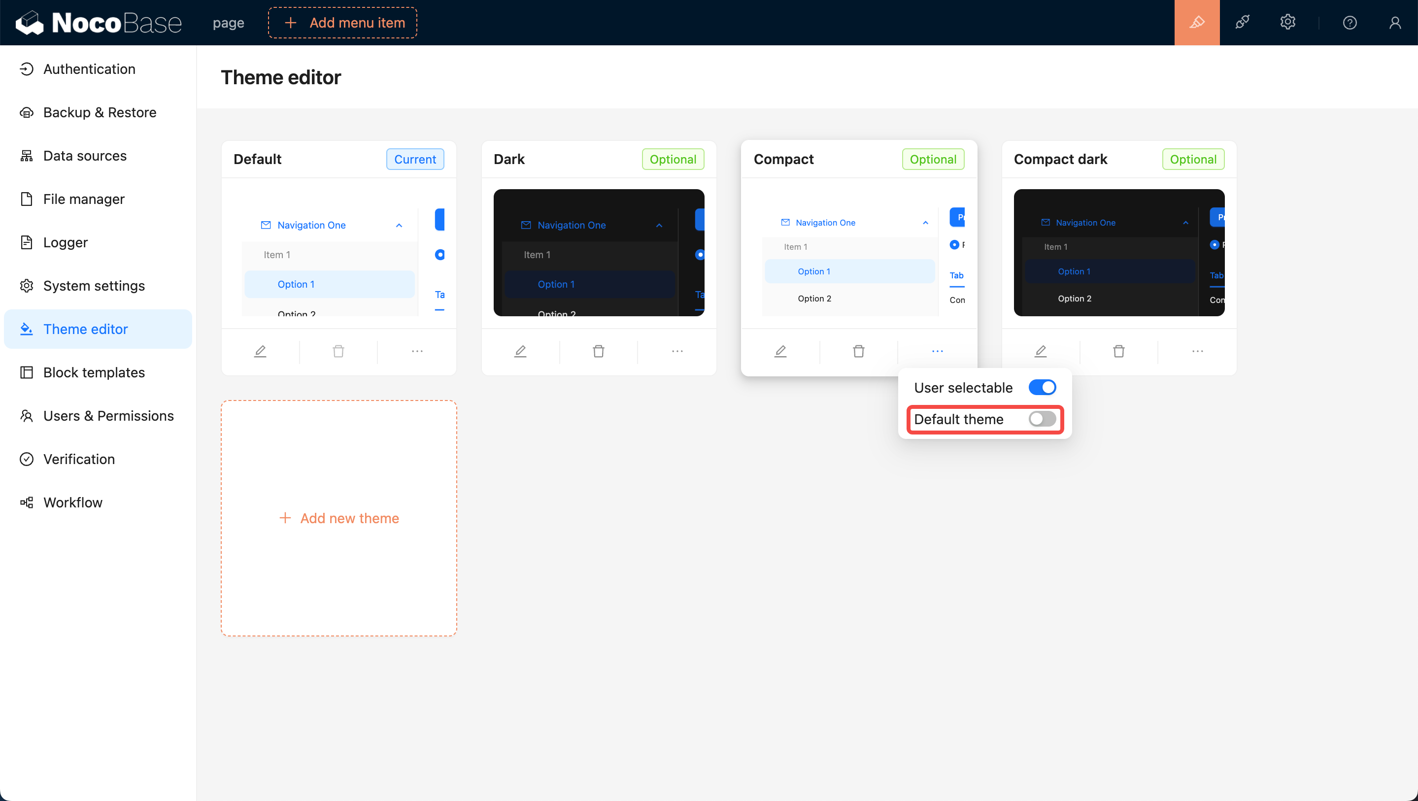
Initially, the Default Theme is set as the default. If you want to set a specific theme as the new default, switch on the Default Theme toggle at the bottom right of the card. This will ensure that when users open the page for the first time, they will be presented with this theme.
Deleting a Theme
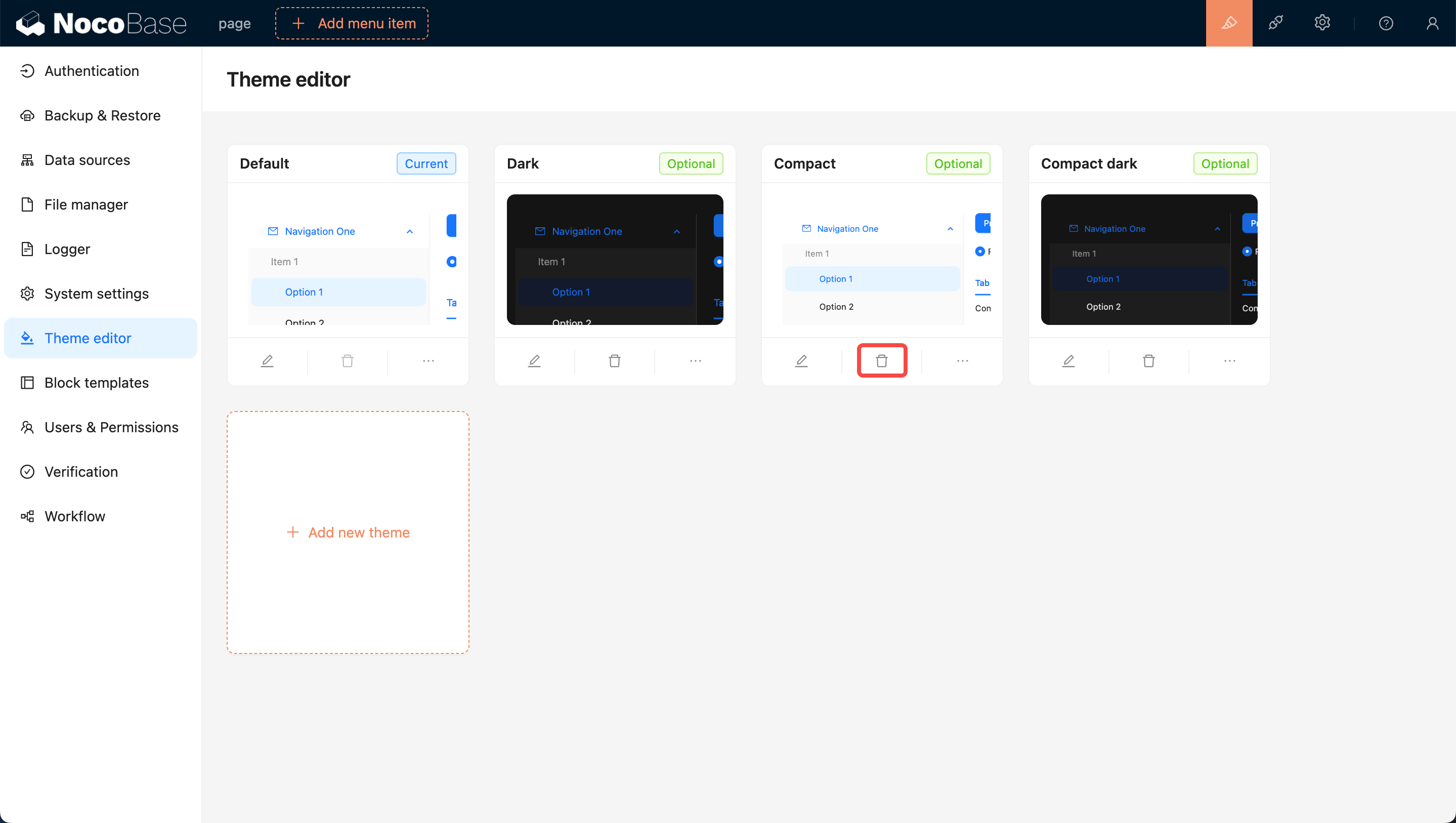
Click on the Delete button below the card, then click on the confirmation button that pops up to remove the theme.
